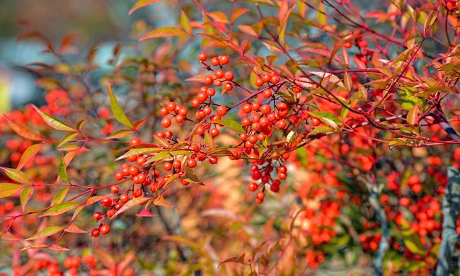
Sometimes a garden just looks right.
This doesn’t happen by chance. The same blooms that attract human eyes appeal to pollinators and other wildlife — and color theory helps explain why.
Color theory describes the guidelines artists and designers use to create and understand visual designs. Color theory relies on the color wheel and how color communicates with culture, psychology, and the human eye. Color temperature and color schemes help guide artists with their design process as well as viewers with their interpretation of that design. In short, color carries meanings and emotions that resonate as a language of its own.
“Design and painting has always been a really big part of my life, so that’s sort of when everything clicked for me,” said Amy Fedele, graphic designer, artist, and avid gardener. “I was struggling a lot when I first started gardening. I couldn’t really find any information on, ‘what is the process for doing this?’ It was just these lists of plants in magazines and everything looked pretty, but it didn’t really give you any idea on how to put it together.”
Fedele started Pretty Purple Door in 2014, a gardening blog dedicated to helping gardeners sustain colorful garden designs year-round. She created a gardening design framework that helps home owners plan out yards that feel compelling, balanced, and personal by evoking principles she learned as an artist and designer.
A lifelong painter and graphic designer since 2005, Fedele gained insight into color theory before learning how to apply that same knowledge to garden beds and backyards.
“It’s almost like stepping inside of a painting or stepping inside of a design and being able to interact with it in a 3D way,” Fedele said. “And it got really interesting for me when I realized every different angle and every different week, things are all blooming at different times…Instead of painting a painting or designing a website, I’m inside of the landscape and I’m able to interact with what I’m doing.”
Flowers and other plants provide aesthetic benefits, especially when each color works together as one landscape. Much like a painting, the same rules apply to the landscapes our eyes find attractive.
We perceive color because our eyes respond to light. The retina of the human eye relies on two types of cells: rods and cones. Rods work in low light conditions, while cones activate in bright environments. Cones contain photo pigments, or rather the molecules we need to detect color.
Most people experience three types of color pigments — red, green, and blue — and have around 6 million cones sensitive to different wave lengths. Many types of wildlife, including birds and insects, have cones with four types. Because of this, birds and insects can perceive ultraviolet light, in addition to the colors humans can perceive. The wavelengths of ultraviolet light are too short for humans’ cones to respond to.
Without realizing it, many gardeners already understand the unspoken importance of color in wildlife interactions. Planting red flowers or tying red yarn around hummingbird feeders helps attract more hummingbirds. Hummingbirds see red more clearly than other colors, because they evolved to understand the color red indicates an abundant source of nectar. Likewise, butterflies are attracted to bright colors.
Plants evolved to produce brightly colored flowers to attract pollinators and other animals. Plants and animals rely on each other to survive, which is why humans (and other animals!) find colorful flowers appealing, too.
In Robin Wall Kimmerer’s book “Braiding Sweetgrass,” Kimmerer entwines indigenous wisdom with her experience as a botanist to explore the relationships between plants, animals, and the earth. Her lessons about reciprocity between plants and animals (including humans) explore how all of our behaviors interconnect in ways science doesn’t always have the vocabulary to explain.
One passage of “Braiding Sweetgrass” details the reciprocal relationship between asters and goldenrod — two flowers that often grow together in the New England region. Their golden yellow and purple hues create a stunning color contrast, for both humans and wildlife.
“As it turns out, though, goldenrod and asters appear very similarly to bee eyes and human eyes. We both think they’re beautiful,” Kimmerer wrote. “Their striking contrast when they grow together makes them the most attractive target in the whole meadow, a beacon for bees.”
When grown together, asters and goldenrod attract more bees than when they grow alone; the union of these two plants benefits them more than working separately.
With an eye towards color theory, yellow and purple are complementary colors. Complementary colors grab attention and create contrast when placed side by side, because they’re direct opposites on the color wheel.
“The way that my art teacher explained complementary colors to me… is that when you place them next to each other, each one is at their brightest,” Fedele said. “So, when you put yellow next to purple, both of them pop and that’s what makes them so eye-catching.”
The same principles artists use to create visuals help us understand the natural world. Naturally occurring contrasts that compel humans also attract insects and other pollinators.
Gardeners can implement these principles to create landscaping that not only looks beautiful to family and friends, but also encourages wildlife interactions that benefit their plants and local ecosystems.
Plants with berries can add a pop of color to a garden while also providing food for wildlife, Fedele said.
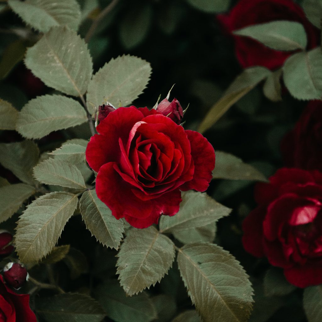
One easy way to introduce complementary colors in the garden is by taking advantage of greenery. Green can be considered a neutral color in garden design, Fedele said, but planting red roses, tulips, or other flowers in front of green hedging helps the flowers stand out. Since red and green are complementary colors, red additions to yards also make green grasses, hedging, or other foliage appear even more green.
Complementary colors combine warm and cool colors to create simultaneous contrast –– or, the idea that both colors appear brighter together. However, gardeners don’t need to rely on only complementary colors to use color theory in their garden beds.
“Obviously, yellow is the complement [to purple], but you could also have a really relaxing or harmonizing garden by not using opposites,” Fedele said. “So if you just went with purple and maybe like pale blues and some pale pinks — those three are next to each other on the color wheel, so that would be more harmonious and peaceful-looking, versus going complete opposite with an orange or a yellow.”
Using the color wheel, gardeners can decide the atmosphere and mood they want to create in their gardens. Complementary colors combine warm and cool tones, but gardeners can plant flowers of similar cool colors, like blue or purple, for a calm environment or warm colors, like red, orange, or yellow, for an exhilarating environment.
“I think a big tip is to pick a color that you’re going to start with. Just one color, that’s what I teach my students,” Fedele said. “If you start with one and work off of that one color, you’re going to be a lot better off than going to the garden center and just picking this yellow plant and then this blue one, you know, just randomly picking one-offs.”
Focusing on one color at the start helps narrow down a set vision and helps gardeners transition through color schemes as the seasons change. Gardeners can even switch moods throughout their yard by adding or changing a color in their design.
Fedele recommends warm tones or complementary colors for active or high energy spaces. Warm colors, or attention-grabbing complementary colors, suit environments for entertaining guests or hosting parties.
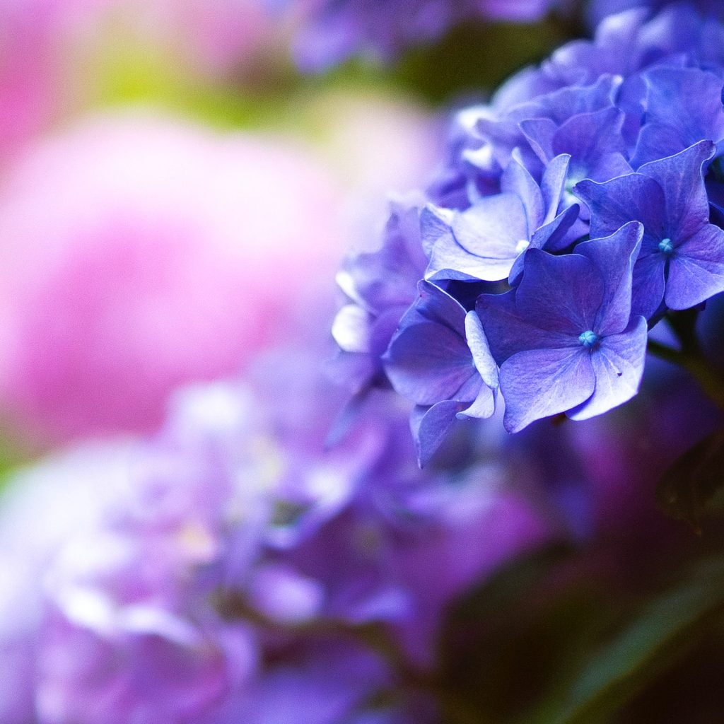
For quiet or private areas, Fedele suggests cool colors, or similar colors, to create a harmonious garden. Fedele’s yard features a reading nook where she plants cool-toned flowers to help her unwind.
“Somebody may just want, if they have a hard day at work, to come home and have a little peaceful, relaxing thing,” Fedele said. “So the way to do a peaceful garden is to use colors that are very similar, like pink, purple, and blue together, [that] are really cool colors and relaxing.”
Sequence and symmetry can be helpful tools in any design, including garden design. Fedele recommends buying plants in groupings of 3, 5, or 7 to create a solid foundation for a balanced and visually-pleasing garden. With a foundation of multiple plants of the same color, gardeners can add other groupings of flowers that are either near or opposite their chosen color on the color wheel.
Color carries connotation, so Fedele recommends researching color meanings to decide which base color to choose for a garden bed or yard.
While colors each have countless meanings to different people, Fedele said a certain adjective associated with a color may stick with a person and influence them to use a color they may not have considered previously. For example, purple carries ties with royalty or witchcraft, but also to creativity.
“There’s the creativity part of purple, which is really what I resonate with. I’m a creative person, here’s my house, here’s my purple door. It shows the world that that’s what’s important to me,” Fedele said. “So I think that using the meanings of colors in a garden design can make it a lot more personal for somebody.”
Fedele offers two online courses to help gardeners plan out their own garden designs. “Design your 4-Season Garden” and “Garden Planning 101” can be found on her website, Pretty Purple Door.

